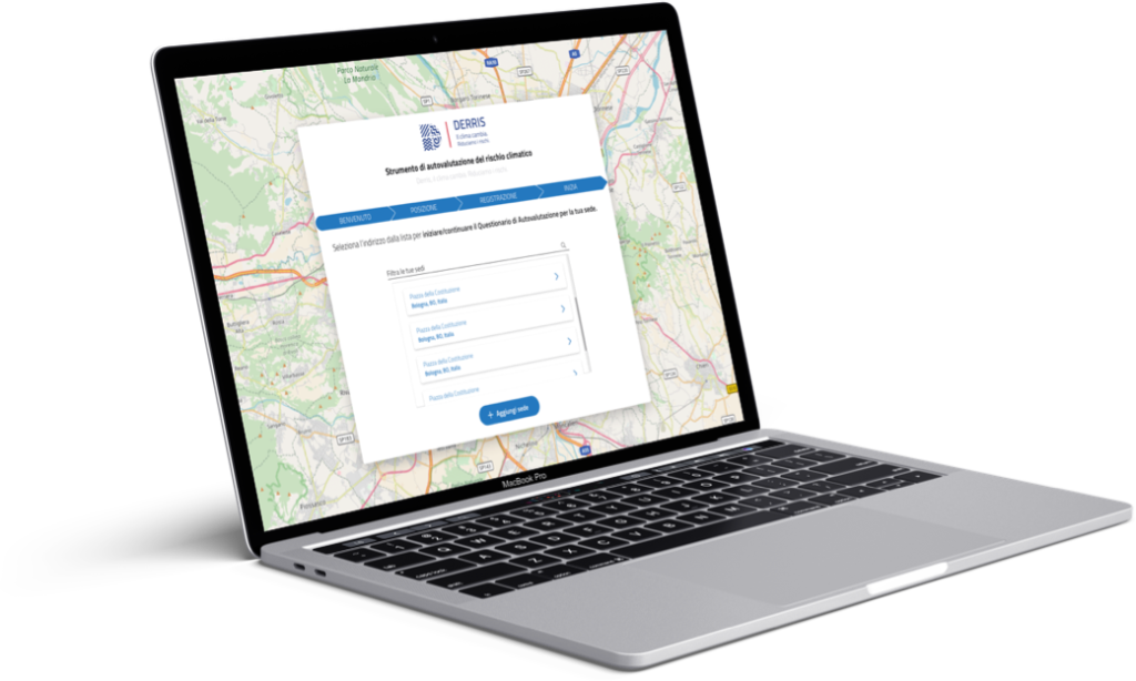
Adaptive View and Responsive design
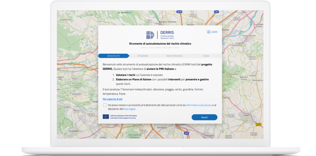
Derris is a self-assessment tool for the climatic risk (CRAM tool) of the DERRIS project. This tool aims to help Italian SMEs to:
- Evaluate the risks to which the company is exposed.
- Develop an Action Plan with the possible actions to prevent and manage these risks. The tool analyzes 7 meteoclimatic phenomena: flood, rain, wind, hail, lightning, temperature, landslides.
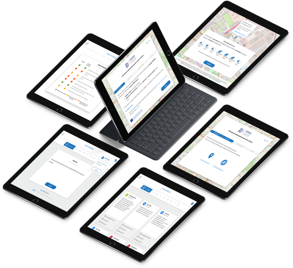
The assigned brief is to make the tool usable even from mobile devices, as it is currently available only on desktops. In the design of the scalability process some improvements have been made in agreement with the client also to the UI part by going to insert new components that can be scaled on all the devices and offer a more unique and coherent experience possible.
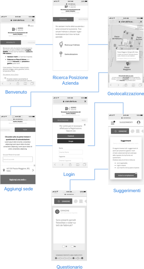
Wireframing
In the initial phase, the information architecture was revised, starting with some sketches on paper, they went on to prototype all the travel options with Axure RP, considering all the support and critical situations in the Mobile version to be preserved in the transition to the views on Tablet and Desktop.
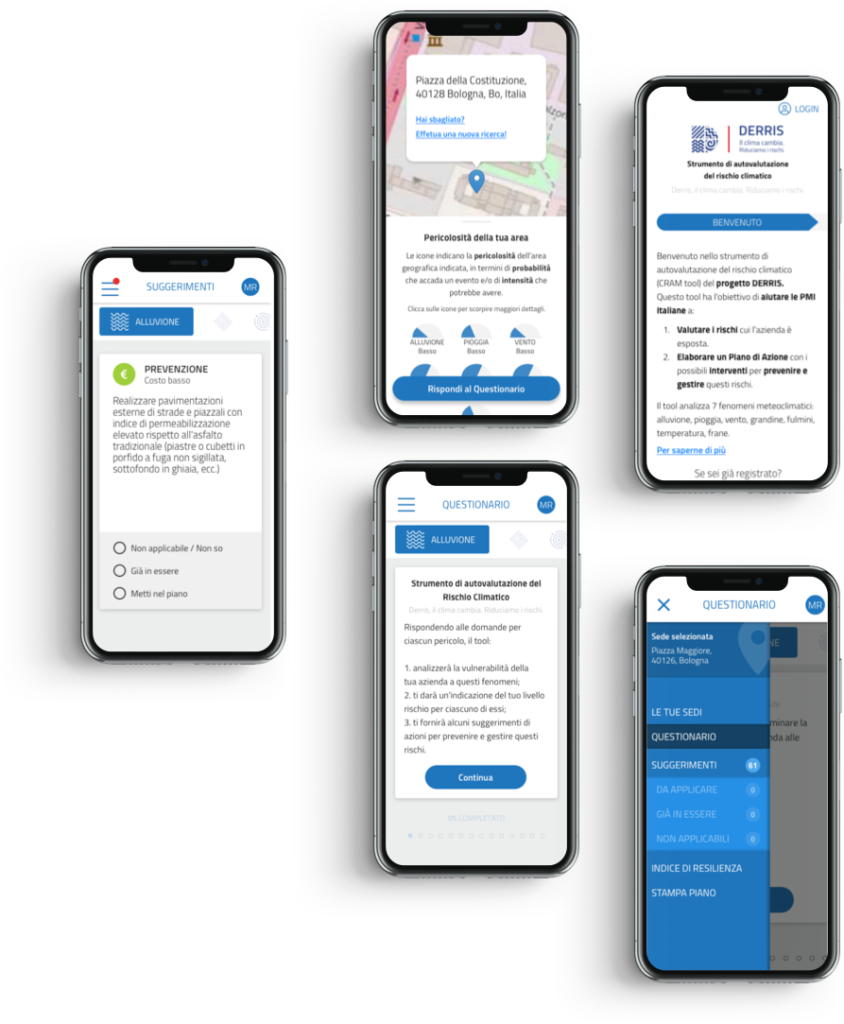
Visual Design
I performed tests on the Wireframe with the client to understand the real usability and consistency in the experience on mobile devices. After the client’s confirmations and e-mails, I switched to the UI part to adapt and scale the entire navigation flow for the 3 Breakpoints declined in the wireframing phase. I provided the entire project to the team of developers through Zeplin.
Mobile
Tablet
Desktop
